
MMM Pastry
Website/Mobile Design
Role: UI/UX Designer — Timeline: 1 month
MMM Pastry is a home-based bakery shop that sells fresh and unique homemade pastries. Due to the high demand of orders, the business is thinking about launching a website to provide a smooth online ordering experience. Instead of having the customers to fill out a google form or send DM to place an order, this website was designed to help the customers explore different options visually and go through more structured checkout process.
Project Overview
MMM Pastry is a home-based bakery business that started out with a google form, DM, and verbal orders. To help the customers to learn more about the business and have a better online ordering experience, I conducted various user research and designed a website based on user feedbacks. The goal was to make it user-friendly and trustworthy.
Problem
Many people love supporting small businesses, like MMM Pastry. However, when it comes to making a purchase the customers are not sure how the ordering system works or often skeptical to order unless they personally know the business owner, as it could seem untrustworthy.
Solution
In order to create a trusted and delightful experience for the potential and existing customers while they shop, MMM Pastry commits to provide a website that includes the business details, high-quality product pictures with detailed descriptions and prices, and secured checkout process.

Google form and DM are some of the methods the business uses to take orders from the customers.

Research & Insight
User Surveys
I conducted a survey with a mix of 10 prospect and existing customers to find out the following what and why.
What - Do customers want this new website that this business is thinking about launching?
Why - So that this business can then work on designing a new website based on customer feedbacks.
Survey Results: 10/10 participants said yes to a new website!
Competitive Analysis
Since the prospect and existing users most likely already have expectations for the user experience and features they may have encountered from different websites, I decided to evaluate the market.
Objective: Evaluate the market to understand how competitors draw users’ attention to their products.
Competitors: Local bakery/pastry shops - Whisk Bakery, Back Home Bakery, and The Cake Shop
Screenshots:

Findings: Based on my observations,
First competitor attracts users with high-quality products and well-structured website.
Second competitor attracts users with countless high-quality product photos/gallery.
Third competitor attracts users with positive customer reviews displayed in the front.
>>> One important feature these competitors lacked was not having a clear CTA on their homepage.
Define
After conducting user surveys and competitive analysis, I mapped out user personas, user goals, and user stories.
User Personas
The prospect and existing users were grouped into two types: small business supporter and pastry lover.

Small Business Supporter: Sarah has been a big supporter of small local businesses. She wants to visit the website to learn more about the business and their products before making a purchase.
Pastry Lover: Emily’s hobby is to explore different bakery and pastry shops and try their unique pastries. She prefers to check out the menu with descriptions and payment methods before making a visit or ordering online.
User Goals
In order to find out what the prospect and existing customers say they want, I mapped out the user goals to observations and content type using their feedback:

User Story
As a next step, I extracted user goals and observations into function and specific user stories as following:

Ideate
Information Architecture
Based on the user story, I organized the content in the most effective and sustainable way. The goal here was to help the users find information they need and complete their desired tasks without any confusions.

Wireframes
After mapping out the information architecture for the new website, I created the low, mid, and high-fidelity wireframes to visualize the website. I used user feedback and made iterations throughout the the process.
Low-Fidelity Wireframes
Before jumping into a design software, I sketched out the following wireframes I envisioned on my notebook. I consistently went back to user research results as I was sketching to make sure everything they had asked for was included.

Mid-Fidelity Wireframes
After sketching out the lo-fi wireframes on my notebook, I went on Figma and created the following wireframes to show more detail - including accurate spacing, headlines, and buttons.

Style Guide
Before moving on to creating the hi-fi wireframes, I created the following UI elements - colors, typography, buttons, and icons - in accordance to brand guidelines. Having a style guide ensures consistency and enforces best practice in usage.

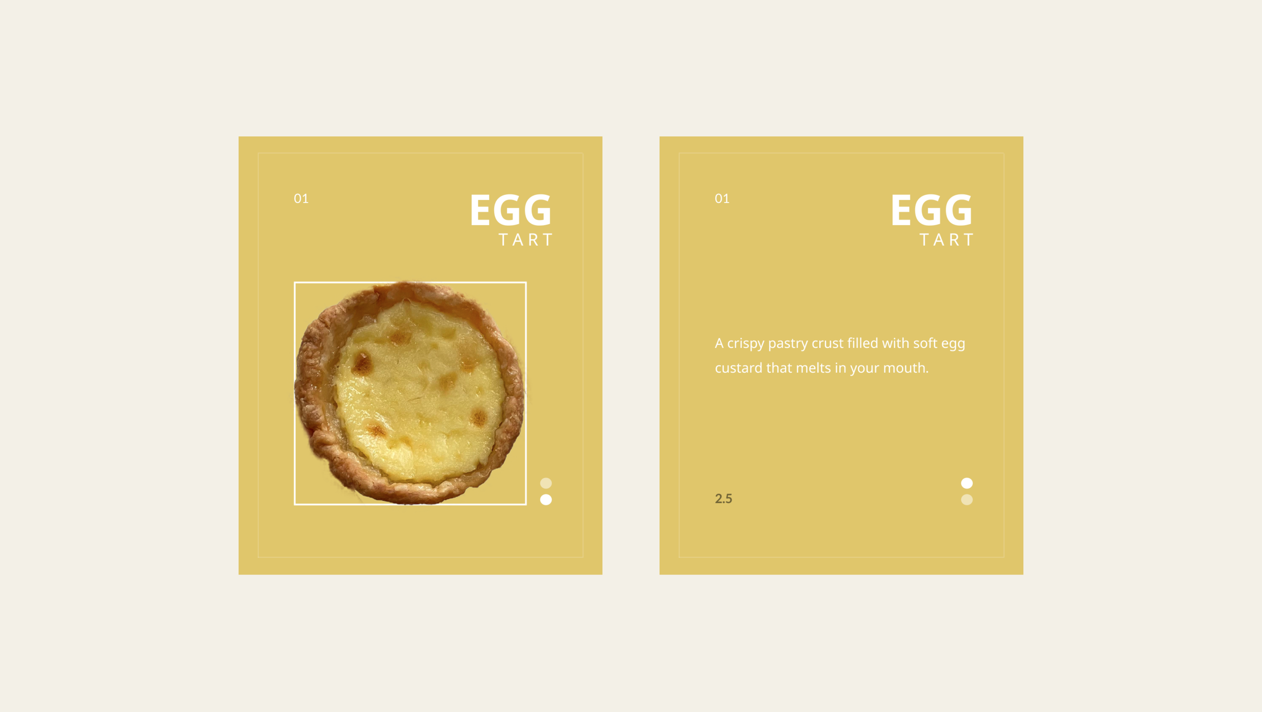
Hight-Fidelity Wireframes
After creating the low and mid-fidelity wireframes, I used the style guide to create the following mockup.
Desktop-view:

Mobile-view:

PROTOTYPE / FINAL DELIVERABLE

Desktop View

Mobile View


Takeaways
I learned that it requires a lot of user research and many rounds of iterations when building a website from scratch.
Using two different types of font, as well as different styles of button, could make a website look inconsistent and unprofessional.
I learned that it’s important to take the time and effort to build a design system because it promotes visual, functional, internal, and external consistency that is vital for building effective products.